 https://ustl.com/wp-content/uploads/2026/03/Glass-jar-of-sauce-in-the-hands-of-the-buyer.jpg
1250
2000
AbstraktMarketing
https://ustl.com/wp-content/uploads/2023/05/USTL-Logo-May-2023-1030x467.jpg
AbstraktMarketing2026-03-25 18:41:552026-05-04 15:27:24Custom Die-Cut Labels vs. Standard Labels: Which Is Right for Your Product?
https://ustl.com/wp-content/uploads/2026/03/Glass-jar-of-sauce-in-the-hands-of-the-buyer.jpg
1250
2000
AbstraktMarketing
https://ustl.com/wp-content/uploads/2023/05/USTL-Logo-May-2023-1030x467.jpg
AbstraktMarketing2026-03-25 18:41:552026-05-04 15:27:24Custom Die-Cut Labels vs. Standard Labels: Which Is Right for Your Product?The Psychology of Marketing Colors: How Product Labels Influence Buying Behavior
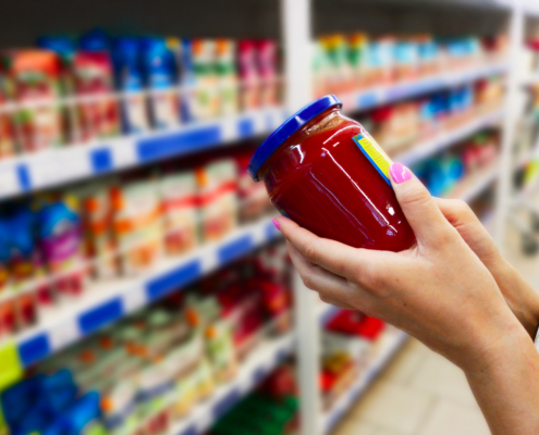
You’re walking down a store aisle, scanning shelves filled with dozens of nearly identical products. What grabs your attention first? Chances are, it’s not the product itself—but the color on its label.
That’s the power of marketing colors. Before a customer ever reads your brand, product name, or ingredients list, their brain is already reacting to the hues and tones on your packaging.
These split-second decisions can shape how a product is perceived—whether it feels luxurious or affordable, natural or synthetic, energizing or calming.
Whether designing your first product label or refining your brand presence, understanding the psychology of marketing colors gives you a valuable edge.
The Brain Behind the Color: Why Marketing Colors Matter
Color is not just decoration; it’s a form of nonverbal communication. Research shows that people subconsciously judge a product within 90 seconds of first seeing it, and up to 90% of that initial impression is based on color alone.
So, when it comes to product labels, marketing colors aren’t just a design choice. They’re a strategic tool.
Think of red. It’s the color of urgency, appetite, and passion. That’s why you’ll often see it on spicy snacks, clearance stickers, or energy drinks. Now contrast that with a soft pastel blue; cool, trustworthy, calming. That shade might be more at home on a skincare serum bottle or a calming herbal tea package.
Choosing the right colors can:
- Increase shelf visibility
- Convey specific product benefits
- Align with brand values
- Influence purchase intent
Take a closer look at the role of color psychology in marketing and its importance on consumer purchasing decisions in this informative guide.
Color Psychology for Marketing: What Each Color Says About Your Product
To effectively use color psychology in marketing, you need to understand the emotions and perceptions each color typically evokes. While individual preferences and cultural differences play a role, specific color associations are surprisingly universal.
Here’s a quick guide to what different marketing colors tend to communicate across industries:
Red: Bold, Energetic, Urgent
In industries like automotive, energy drinks, and hazardous materials, red grabs attention instantly. It conveys speed, strength, and power—ideal for performance products or warning labels. A performance car care product with red packaging signals intensity and action, while a red hazard label communicates danger without a single word.
Blue: Trustworthy, Professional, Calming
Pharmaceutical, beverage, and private-label products rely on blue for credibility and peace of mind. A cobalt blue bottle of bottled water looks refreshing and clean, and a pharmaceutical label with a soft blue background creates an immediate association with safety and reliability.
Green: Natural, Fresh, Healthy
This is a go-to for lawn & garden, cannabis, food, and health and wellness products. Vibrant green communicates organic, eco-conscious values. Think of a plant fertilizer using deep forest green to reinforce strength and growth or a cannabis tincture using pale sage green to signal wellness and calm.
Yellow: Optimistic, Fun, Eye-Catching
Yellow invites attention and cheerfulness in promotional products, snacks, and children’s goods. For example, a lemon-flavored seltzer might use bright yellow to cue taste and energy. Yellow can also be a playful contrast on a promotional giveaway sticker or seasonal food label to inject excitement and positivity.
Orange: Adventurous, Friendly, Energetic
Great for value-driven consumer goods, automotive accessories, and seasonal promotions, orange feels warm and approachable. Imagine an orange label on a fall-themed beer can—it feels festive and cozy. In automotive, orange is often used for DIY or garage-focused products because of its high visibility and accessibility.
Purple: Premium, Mysterious, Indulgent
Wine, beauty, and cannabis brands use purple to imply sophistication and sensory richness. A deep plum wine label evokes luxury. For a CBD skincare product, lavender-toned packaging hints at relaxation and holistic benefits. It’s also used to differentiate high-end from everyday products.
Black: Elegant, Powerful, Minimalist
Black is perfect for liquor, craft beer, automotive detailing, and high-end consumer goods. A matte black label on a whiskey bottle instantly communicates exclusivity. In the automotive industry, black conveys professional-grade power for detailing products. In beer, it’s often used for limited-edition stouts or barrel-aged releases.
White: Clean, Pure, Minimalist
White is often used in health and beauty, pharmaceuticals, and premium food. It suggests simplicity, cleanliness, and modern design. A white cosmetic label with gold foil accents looks clinical yet upscale. In pharmaceuticals, it reassures customers that the product is sterile and trustworthy.
Pink: Soft, Romantic, Playful
Often used in health & beauty, beverages, and promotional products, pink communicates sweetness, self-care, or indulgence. A rosé wine label in blush pink gives off feminine, chic vibes. For beauty brands, it’s a go-to for gentle and approachable packaging.
It’s not just about picking a single color; it’s about combining and contrasting colors on your label to create the desired impact.
Poor color schemes are just one of the many common label design mistakes brands make. Explore avoidable mistakes to avoid when designing your product labels or marketing materials.
Best Practices for Choosing Marketing Colors on Product Labels
So, how do you choose the right palette for your label? Here are a few tips:
- Start with your brand personality. Are you playful or polished? Rustic or refined? Let your values guide your choices.
- Consider your target audience. Younger shoppers may respond to bold, energetic colors, while older consumers might prefer subtle, calming tones.
- Think about your industry. While you don’t have to follow the norms, understanding them can help you decide whether to align with them or break the mold.
- Test in real life. Colors can look different in digital design vs. printed labels. Always test on actual packaging materials.
- Balance contrast and legibility. High-contrast labels catch attention, but if your text blends into the background, your message will be lost.
Psychological Triggers: How Marketing Colors Influence Buying Decisions
Color has a direct line to emotion, and emotion influences decision-making far more than we realize.
Think of the red “Sale” sticker. It’s not just functional. It’s designed to spark a reaction: urgency, fear of missing out, action. In contrast, a light blue label on a cleaning product conveys a sense of peace and cleanliness, making customers feel that the product is gentle and safe, even before they read the fine print.
Subtle cues like these shape the stories our brains create about products. That story, often formed in less than a second, nudges us toward one item over another.
Put the Science of Color Psychology for Marketing To Work With U.S. Tape & Label
At U.S. Tape & Label, we’ve partnered with businesses across industries—from beverage and beauty to cannabis and consumer goods—for decades, helping them leverage the power of color to elevate their packaging. Our experienced team ensures your marketing and branding colors reflect your brand identity, resonate with your audience, and inspire action. Ready to see how color psychology can boost the impact of your label and marketing strategy?
Contact us today to start the conversation.
Share This Post
More Like This
 https://ustl.com/wp-content/uploads/2026/03/Glass-jar-of-sauce-in-the-hands-of-the-buyer.jpg
1250
2000
AbstraktMarketing
https://ustl.com/wp-content/uploads/2023/05/USTL-Logo-May-2023-1030x467.jpg
AbstraktMarketing2026-03-25 18:41:552026-05-04 15:27:24Custom Die-Cut Labels vs. Standard Labels: Which Is Right for Your Product?
 https://ustl.com/wp-content/uploads/2026/01/How-Label-Shapes-Influence-Consumer-Behavior.jpg
1250
2000
AbstraktMarketing
https://ustl.com/wp-content/uploads/2023/05/USTL-Logo-May-2023-1030x467.jpg
AbstraktMarketing2026-01-26 07:42:402026-05-04 15:27:25How Label Shapes Influence Consumer Behavior
 https://ustl.com/wp-content/uploads/2026/01/Custom-Labels-vs.-Stock-Labels.jpg
1250
2000
AbstraktMarketing
https://ustl.com/wp-content/uploads/2023/05/USTL-Logo-May-2023-1030x467.jpg
AbstraktMarketing2026-01-23 10:37:202026-05-04 15:27:25Custom Labels vs. Stock Labels: Which Is Right for Your Product?
Comparing Shrink Sleeve and Pressure-Sensitive Labels: Which Is Better for Your Food Label?
 https://ustl.com/wp-content/uploads/2025/05/How-Custom-Die-Cut-Labels-Benefit-Your-Products-and-Packaging.jpg
1250
2000
AbstraktMarketing
https://ustl.com/wp-content/uploads/2023/05/USTL-Logo-May-2023-1030x467.jpg
AbstraktMarketing2025-05-27 13:24:122026-05-04 15:27:29How Custom Die-Cut Labels Benefit Your Products and Packaging
 https://ustl.com/wp-content/uploads/2024/12/Industrial-Label-Printing-Process-side-view.jpg
1250
2000
AbstraktMarketing
https://ustl.com/wp-content/uploads/2023/05/USTL-Logo-May-2023-1030x467.jpg
AbstraktMarketing2024-12-17 15:15:222026-05-04 15:27:31The Benefits of Creating A Custom Product Label
  https://ustl.com/wp-content/uploads/2024/09/Large-printer-format-inkjet-working.jpg
1250
2000
AbstraktMarketing
https://ustl.com/wp-content/uploads/2023/05/USTL-Logo-May-2023-1030x467.jpg
AbstraktMarketing2024-09-16 09:34:102026-05-04 15:27:31Why Use Custom Label Printing Services?
 https://ustl.com/wp-content/uploads/2024/08/Comparing-Shrink-Sleeve-vs-Wrap-Around-Labels.jpg
1250
2000
AbstraktMarketing
https://ustl.com/wp-content/uploads/2023/05/USTL-Logo-May-2023-1030x467.jpg
AbstraktMarketing2024-08-29 13:00:252026-05-04 15:27:32Comparing Shrink Sleeve vs Wrap-Around Labels
 https://ustl.com/wp-content/uploads/2024/08/Does-My-Company-Need-New-Product-Labels-7-Signs-Its-Time-To-Upgrade.jpg
1250
2000
AbstraktMarketing
https://ustl.com/wp-content/uploads/2023/05/USTL-Logo-May-2023-1030x467.jpg
AbstraktMarketing2024-08-28 14:23:382026-05-04 15:27:32Does My Company Need New Product Labels? 7 Signs It’s Time To Upgrade
https://ustl.com/wp-content/uploads/2024/08/Does-My-Company-Need-New-Product-Labels-7-Signs-Its-Time-To-Upgrade.jpg
1250
2000
AbstraktMarketing
https://ustl.com/wp-content/uploads/2023/05/USTL-Logo-May-2023-1030x467.jpg
AbstraktMarketing2024-08-28 14:23:382026-05-04 15:27:32Does My Company Need New Product Labels? 7 Signs It’s Time To UpgradeGet In Touch
Phone
(314) 824-4444
Why U.S. Tape & Label?
Centrally-located and equipped with the cutting-edge equipment you need to get the best labels and look for your products. Our skilled team of in-house engineers will help you make the perfect label for any product you have.
